Saturday, November 22, 2008

B is for Bohus, Revisited

BohuslabelI’m breaking with my established pattern and the usual sequencing of the alphabet by looking back at one of my first posts and updating it. I suspect that once I’ve finished the abecedarium (extended with typographical symbols, of course), I will probably revisit several letters, but this one has asserted itself as a priority. I wrote last January about Bohus Stickning, and have finally had the very great pleasure of experiencing Susanna Hansson’s Bohus Stickning class (courtesy of Stitches East, held in Baltimore earlier this month). I am now acutely aware of how much more there is to say on the subject and how much I need to correct in my earlier post. Susanna’s class was so wonderful and there is much to report on it alone, so this post will be less a result of musing on general research and more an appreciation for a really gratifying learning experience. I’m going to try not to repeat myself, so if you’re interested in a general history of the Bohus Stickning collective, please read my earlier post or one of the many, many excellent online pieces listed at the end of this post.

IMG_8456
Everyone’s Blue Shimmer
wristlets, in progress
Susanna distributed an incredible set of handouts that she had developed over years of perfecting this workshop. The handouts included a very thorough, annotated bibliography, a terrific pattern, and some nice geo-historical information. Her class project, a pair of wristlets, was an ideal way to appreciate the tiny Bohus gauge, the genius of its color combinations, and the lovely visual effect of its knit-purl changes. Solveig Gustaffson of SOLsilke has recreated Bohus-worthy yarns—50% angora/50% wool, dyed to match the five delicate and very particular original colors. So yes, the yarn for this project came to Baltimore via Seattle, all the way from Sweden (and before that, Denmark, where it was spun), and how divine it is! The pattern derives from part of the quintessential, iconic Bohus Stickning design, Blue Shimmer (Blå Skimmer in Swedish), by Anna-Lisa Mannheimer-Lunn. There are some lovely pictures of Blue Shimmer wristlets, hats, and sweaters on Flickr.

DSC06201
Blue Shimmer wristlets, completed.
Blue Shimmer
design by Anna-Lisa Mannheimer-Lunn in 1947.
As we progressed through the class, the delicate yarns seemed to float into the emerging wristlets, and Susanna edified us with information about the Bohus Stickning collective, its fearless leader, its cultural place in mid-century Sweden, and how all those factors were borne out in the sweaters. Her digital slide show was fabulous—full of remarkable, unpublished discoveries about how people (women themselves and gift-giving fathers & husbands) in America and Sweden acquired their original Bohus Stickning garments, and the place the sweaters have had in their lives ever since. And although it’s hard to settle on one highlight out of so many that day, seeing the selection of vintage sweaters Susanna brought from her collection was certainly it.

IMG_8426_2
Vintage Bohus Stickning sweaters from the collection of Susanna Hansson. Top right design is The New Azalea, 1963, by Kerstin Olsson, and lower design is Aquamarine (also by Olsson, also 1963).
In fact, a major component of the learning process was an archaeological exercise that Susanna had developed to encourage her students to really examine the structure and techniques in all her vintage sweaters, hats, scarves, and gloves. We were given conservation-safe gloves for handling the fragile garments, which gave an added sense of their worth and historical value. A series of questions challenged us to tease out histories for each of them.

Seeing and “uncovering” the real Bohus sweaters (with Susanna’s guidance, of course) was a remarkable experience on so many levels. It gave me such a palpable sense of the Bohus Stickning collective and its relationship to Swedish (and global) history.
IMG_8445_2
Kerstin Olsson, Myrtle, 1967.
It emerged during the war years as a response to dire economic conditions, but came into its own during the heady years of Western excess in the 1950s and 1960s. The sweaters were worn tight and tucked in; the favorites of movie stars and people in the limelight, and fashionistas with very exacting standards who could afford the high prices that went towards paying rural knitters, dyers, wool sorters, and yes, the designers, too. The high prices also meant that women who were lucky enough to acquire Bohus Stickning sweaters really cherished them and valued their gorgeous designs and fine craftsmanship.

IMG_8430_2
A blue version of Kerstin Olsson’s
design, The Egg, ca. 1963-65.

Lessons Learned
In the murky land of “before this class,” I had set up a pretty firm mental distinction between Bohus, the technique, and Bohus Stickning, the cultural phenomenon. Susanna, however, did not seem to want to distinguish them. As a firm believer in the precepts set forth by the great Emma Jacobsson, founder and doyenne of Bohus Stickning, Susanna made an excellent case for maintaining the very high standards of the one and only true Bohus: knit at 9 stitches to the inch in angora/wool and after patterns developed by the six designers of Bohus (namely: Emma Jacobsson, Vera Bjurström, Anna-Lisa Mannheimer Lunn, Annika Malmström-Bladini, Karin Ivarsson, and Kerstin Olsson). Perhaps I’m reading too much into Susanna’s ideological stance, but I think there’s something to the concept. Jacobsson worked assiduously to protect both the Bohus Stickning style and the products of the Bohus Stickning cooperative. Diluting the fineness, exquisite color sensibilities, and incredibly high standards does a disservice to the rich legacy left us by the talented designers and knitters of Bohuslän. A garment designed and knit with a similar combination of knit and purl stitches at a more forgiving gauge is beautiful on its own merits, it just isn’t right to call it a Bohus. We should probably find a different name all together for the technique.

IMG_8434_2
New Azalea, by Kerstin Olsson, 1963.
My big, huge, disappointment of the day was that a number of my best photographs of Susanna’s extraordinary vintage Bohus Stickning collection were corrupted. I had borrowed a nice camera for the weekend, and really should have spent some more time setting it up for the big moment, but I was too excited by the prospect of so much yarn and learning. However...perhaps this photographic tragedy is a sign from God that I must get myself out to Minneapolis for the event of the season: the opening of “Radiant Knits: The Bohus Tradition” in January.

(Linked) ad for the Radiant Knits exhibition, opening January 23, 2009, at the American Swedish Institute in Minneapolis, and sponsored by the Minnesota Knitters’ Guild
Yes, that’s right: there will be a Bohus exhibition in my very own country, featuring many pieces from Susanna’s extraordinary collection, sponsored by the Minnesota Knitters’ Guild, and mounted at the American Swedish Institute. The opening weekend in January will bring together Bohus re-creator Solveig Gustafsson, foremost teacher of Bohus Stickning Susanna Hansson, filmmaker Kjell Andersson (and his film, “Bohus Knitting – From Relief Work to World Success”), original Bohus designer Kerstin Olsson, and American dyer and Bohus yarn producer Mary Jo Burke. In addition to her tantalizing description of the exhibition, Susanna let it be known that Solveig Gustafsson is likely to release some new kits expressly for the exhibition, including (possibly, it must be said!) New Azalea, which was my favorite of all the scrumptious sweaters Susanna brought to Baltimore, and will certainly top my queue when it’s available as a kit.

DSC06194
Yarn for the Gray Mist sweater, newly arrived from SOLsilke in Sweden
Earlier this week, the makings for my very own Bohus sweater arrived from Sweden, on the very same day as an invitation to the opening of the exhibition in Minneapolis. Bohus Boon Day! I shouldn’t have photographed the yarn at all, because it’s really a gift for me, destined for a place under the Christmas tree. I shouldn’t have, I shouldn’t have, but how could I possibly not open this box with all its promise and check to see that its contents were all in order? The pattern is called Gray Mist, designed by Kerstin Olsson in the early 1960s, and inspired by a Paris fashion show that featured subtle, graded tones. Olsson designed several “mists,” each with a slightly different hue: Gray Mist, Green Mist, Brown Mist, and Gold Mist. The main color in Gray Mist is a dark gray—not quite charcoal, but with a slight tendency toward green. The other colors tend toward blues and one is decidedly periwinkle. But how could I possibly know all of this, having merely glanced at the contents of the box? What a delicious prospect for Boxing Day.

News Flash:
Bohus Gray Mist
Gray Mist underway
The new kits that Solveig Gustafsson has created for the exhibition, Radiant Knits, are now available via the American Swedish Institute’s online shop, Shop Swedish. Newly re-created designs include: Gothic Window (in blue and pink), Blue, Red & Turquoise Light(s), Rime Frost, and New Azalea, in addition to other wonders: Blue Shimmer, Swan, Large Lace Collar, Green & Gray Mist(s), Forest Darkness, Green Meadow, and Wild Apple. I believe Gold, Scilla, Blue Flower, the Egg, Sago & Red Palm(s), and Yellow & Rose Lace Collar(s) are only available via SOLsilke.

Fox News 9 coverage: “Historic Swede Sweaters on Display”


IMG_8408
Slice of a Bohus Stickning design with live stitches showing the yarn’s angora content.

More, more, more


Radiant Knits Exhibition Information
DSC06191
The “come hither” package.

Other Blog Posts about Susanna Hansson’s Bohus Stickning Class
IMG_8452
A few choice pieces from Susanna Hansson’s extraordinary collection.

Saturday, November 15, 2008

R is for Red Letters

DSC_0032Lively, assertive, challenging, alluring, frightening, gorgeous, shocking. Red is all that and so much more. So utterly central, this primary of primary colors contradicts and unifies, attracts and repels, radiates and absorbs. It symbolizes life and death, transgressions and sanctity, luck and doom. It’s virtually impossible to feel ambivalent about red. You either love it or you hate it. I love it, and I hope you do, too.


IMG_7562Red letters represent red’s contradictory personae particularly well. On the one hand, they signify providence and joyful anticipation, but on the other, they stand for punishment and shame. “Red letter days” are important days, full of promise. The term derives from the red ink used to mark saints’ days on liturgical calendars. Embellishing a religious text with red letters (notes, marginal symbols, above all, directions to the pious) is rubrication, from the Latin rubricare, which means “to color red.” The term, miniature, did not originally mean small. It simply described illustrations for devotional texts. In fact, it actually meant red picture. The word miniature derives from minium (also Latin), a kind of red lead that was widely used to color ink drawings.

DSC01534Shift slightly from red letters in a general sense to scarlet letters, and the meaning changes entirely. Hawthorne famously titled his story after the letter A that Puritan magistrates used to punish adulterers in the Massachusetts colony under the strict rule of the Mathers and their ilk. Apparently, they also commanded burglars to wear Bs, drunkards to wear Ds, rogues to wear Rs, thieves to wear Ts (branded into the skin—if you’re really into that stuff, James A. Cox of the Colonial Williamsburg Foundation has written quite a bit about it). I hope my R doesn’t brand me a rogue (can women be rogues?)! I prefer to think of it as a celebratory portent of some exciting day in the future.

IMG_7528Red Dye
Alizarin, carmine, red ochre, vermilion...we have many natural and chemical reds at our disposal for dyeing, painting, tinting, and basically painting any town red (there’s a nice etymology for that phrase, by the way). But that wasn’t always the case. Although there were many natural elements that could tint fabrics red, most of them produced fugitive colors that faded quickly. The Mayans, however, discovered an excellent source for dye that produced a vivid, durable, red red: cochineal, still the gold standard for natural red dyes. The Spanish stole that state secret, but didn’t realize its full market potential for several decades, and when they did, cochineal husbandry became a Spanish state secret. It was eventually stolen by the French and English, but is still raised successfully using centuries-old traditions in Oaxaca, Mexico. The dye is derived from the Dactylopius coccus bug’s blood. The fussy insect feeds off of particular kinds of cactus that grow particularly well in Mexico, and are susceptible to cold and humidity. Once dried and crushed, the bug becomes a dye pellet.

DSC03920Cochineal’s vivid red was so remarkable, so sought-after that it drove major global markets, supported economies, and made red the ultimate symbol of power and wealth. The Spanish love of red easily traces back to its national pride in its control of the cochineal market during the sixteenth, seventeenth, and eighteenth centuries. Red was expensive and bold, a clear sign of power and panache. It is no accident that Cardinals began wearing red, rather than blue or purple in the fifteenth century (even before cochineal red was known in Europe). It seems incredible to conceive of a color economy, but red really did control financial markets.

dogwoodOf course cochineal wasn’t the first red dye. In Europe, other natural dyes included madder and kermes, a sort of cousin to cochineal—darker and more purplish. The madder dyers of Strasbourg, alarmed at the sudden popularity of blue, petitioned the builders of Strasburg Cathedral to make the devil’s skin blue in all the stained glass windows, so that church-goers would associate blue with evil, rather than red.

My favorite medieval use of red is in the six unicorn tapestries in Paris’s Musée Cluny. While one represents the whole series, the five others each illuminate one of the senses. The museum has created a special theatrical viewing room so that its visitors can properly take in the sequence and really experience this extraordinary work as the spectacle it was always meant to be. It seems incredible that the six tapestries should have been hidden for so long, only to be re-discovered by Georges Sand in 1844 in an obscure château.

redcurrantsSymbolism
Red has been a major component of most symbolic systems, traditional and theoretical. The great expressionist (theosophist, mystic) artist and theoretician Wassily Kandinsky articulated a theory for most colors, and red is no exception. He thought of red as “alive, restless, confidently striving towards a goal, glowing” and emanating a “manly maturity.” Its auditory equivalent, he proposed, was the “sound of a trumpet, strong, harsh,” as in a fanfare, or both the lower notes of a cello and the high, clear sound of a violin.


IMG_7504In China, red generally stands for luck, but when combined with letters (characters is more correct, I think), can also stand for death. Obituaries, apparently, are usually written in red ink. When a name appears in red, it signifies that the person has either died or that they have been disowned or shunned in some way.

InksThere are countless other symbolic associations with red, and if I started considering political associations, advertising uses, non-verbal signage, etc., I’d never get back to the needles! My knitted red letter R uses Shetland yarn and a modified Fair Isle technique (modified, because the floats are so long). I was trying to mimic the capitals of a manuscript Bâtarde “hand.” A French manuscript style in use from the late 13th to the mid-sixteenth century, Bâtarde hand was bastardized from the more laborious Gothic lettering into a cursive form, which was much faster to write. This particular hand was favored by the Burgundian court, and applied extensively in the creation of manuscript books. One of its distinctive features was that the scribe would change the pen angle several times during the execution of each letter so that the each letter contained both very thick and very thin strokes.

berriesI have longed planned to design a red and gray Fair Isle, in a sort of hommage to a familiar and favorite winter sight. There’s something about the winterberry tree that I find really, really compelling. It’s just now coming into its own. Maybe I love it so much because it is the only bit of color in January? I believe the horticultural name is Crataegus viridis, cultivar Winter King (a type of hawthorn). I find the combination of red and gray really compelling. Bold and muted, outspoken and understated, the two colors (and yes, I’m considering gray a color here) contrast one another beautifully.

gaziantepspicesNewtxDSC03185IMG_6529IMG_8434_2


booksRed Bib
  • Greenfield, Amy Butler. A Perfect Red. NY: HarperCollins, 2005.
  • Pleij, Herman (translated by Diane Webb). Colors Demonic and Divine: Shades of Meaning in the Middle Ages and After. NY: Columbia University Press, 2004.
  • Dekanare, François, and Bernard Guineau (translated by Sophie Hawkes). Colors: the Story of Dyes and Pigments. NY: Abrams, 2000.
  • Kandinsky, Wassily. Complete Writings. NY: DaCapo, 1994.
  • Erlande-Brandenburg, Alain. La dame à la licorne. Paris: Musée Cluny, 1979.
  • and for fun: Chevalier, Tracy. The Lady and the Unicorn. NY: Dutton, 2004.

  • IMG_7592Red Letters


    IMG_2536Unicorn Tapestry

    Saturday, September 27, 2008

    Q is for Quatrefoil

    QletterNot trefoil, not cinquefoil, but quatrefoil, the architectural equivalent of a four-leaf clover. I want to thank Dee D and Carrie K for this most excellent thematic suggestion.

    In English, the letter Q rarely appears alone, but the OED has of course tracked down innumerable instances, one of which I find oddly compelling: “Q in the corner. . . a person who or thing which sits in the corner, one who is unnoticed or unimportant; also as a (self-mocking or self-effacing) pseudonym.” Perhaps Q’s queue is always off getting into other people’s business, leaving him to hide in the corner?

    DSC05864The letterpress landscape is littered with Qs: quad (short for quadrat), quoin, quarto, quire, question & quotation marks, even quadrata (Roman inscriptional capitals, of which I am particularly fond). With such a rich field of possibilities, it was difficult to settle on just one, but the quatrefoil is so delectable! Yes, of course I did consider qiviut, (an Inuit term for the wool of the musk ox), and almost indulged in a $60 skein of it, but the economy isn’t quite supporting that kind of research just now (at least not for me).

    IMG_6869
    Quadrille
    I am struck by the preponderance of Latin roots for many English q-words that emanate from quad (4), or at least to the concept of dividing into four parts: quatrefoil (in French, quatre–4– and feuille, leaf), quadrille (a card game or square dance...or graph paper), quadrilateral . . . Whether it’s four sides, four parts, or foursome, “quad” words imply a kind of separation just as much as they convey principles of symmetry, mirroring and equality. In other words, they allude to the whole as much as to its four equal parts. The quatrefoil is an excellent example of a whole (in this case, a circle), precisely and geometrically sub-divided and re-combined into a new, four-part shape. Take a look at SkillsTech Australia’s presentation, Guide to Drawing a Quatrefoil, and learn how to use simple geometry to create a perfect quatrefoil (then carve it in stone!).

    IMG_2465
    Sainte Chapelle Quatrefoils
    I tend to associate quatrefoils with architecture, and certainly that is their best-known application, but they do also appear in other forms of ornamentation, including in manuscripts. Despite manuscript possibilities, the architectural quatrefoil is what appeals more to my tactile sensibilities. A form of tracery, the stone quatrefoil is not quite free-standing, but usually exists as thin, stone outlines, leading the eye from one zone to the next. Often, quatrefoils enclose stained glass, but the four-leaved plant motif can also appear as part of the stained glass itself.

    IMG_2449
    Stained glass of Sainte Chapelle
    The preference in Gothic architecture for quatrefoils has produced a legacy of four-leaved ornaments that enriches architecture of the Late Middle Ages. In Paris, for instance, the gem-like Sainte Chapelle (late 13th century) showcases some of the world’s most celebrated stained glass, much of it outlined by quatrefoils.

    IMG_2338
    Tower, Notre Dame de Paris Cathedral. Gallery of chimeras (grotesques) designed by Viollet-le-Duc, mid-19th century


    A few steps away from Sainte Chapelle is the less ethereal, but oh-so-storied Notre Dame de Paris Cathedral, an earlier, much more massive structure. On its tower (right), alongside human-sized grotesques in the galerie des chimères, Viollet-le-Duc built a retaining wall of open quatrefoils in the mid-nineteenth century. He meant them to look medieval, and has fooled generations of tourists ever since (including Disney, apparently) into thinking them ancient.

    Wynkyn de Worde’s “Sagittarius” Printing Device. Reprinted in Henry Plomer. A Short History of English Printing, 1476-1898. London, 1900.
    Source: Project Gutenberg
    Wynkyn de Worde, one of my most favorite early printers (and I’ll freely admit it’s mostly because of his beguiling name), printed a poem in a small volume entitled Four Leaves of the Truelove (The .iiii. Leues of the Trueloue) in 1510. It was a piece of religious allegory, sometimes also called the The Quatrefoil of Love. Although there is some debate about the poem’s merits and message, most scholars agree that the central emblem—the quatrefoil, or four-leaved plant—refers literally to Paris quadrifolia (true lover’s knot), a woodland plant that still exists in Europe. A relative of the trillium, it has four equally-sized leaves emanating from a single stem, and one lone, toxic berry. Perhaps the nickname refers to the berry’s seeds, which are (in small doses, one hopes) occasionally used as an aphrodisiac. The poem gives us some insight into why the quatrefoil was such an enduring motif in medieval architecture.

    True Love (Paris quadrifolia). Taken June 2008. Source: Flickr. All rights reserved. Used with permission.
    Naturally shaped like a cross, the plant’s form was useful for explaining Christian virtues, and a perfect vehicle for allegory. 4 gospels, 4 apostles, 4 sides of the cross: Christian iconography was (and is) rife with foursomes. In medieval European philosophical discourse, we also find much pondering of the 4 humors, 4 winds, 4 cardinal directions. So a sort of rule of four was at work. As much a logical division as a logical combination, the symbolic quatrefoil appealed to medieval stonecarvers and poets alike.

    DSC05898
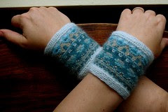
I was delighted to learn that there are at least two quatrefoil motifs in knitting: the quatrefoil eyelet and the Walker quatrefoil cable. Since I’m looking at the quatrefoil’s architectural aspect, I took the cable as my inspiration. I wanted to produce a knitted tracery enclosure for a sort of stained glass-like motif in the quinacridone-like colors (thank you, Denise!) of Brown Sheep’s Lamb’s Pride. My plan was that the cables would provide structure and boundaries, while the intarsia & stranded colors would pop out from the black background. I couldn’t quite get the cables to do my bidding, so I resorted to an applied I-cord, twisting around the central Q. It looked like a cartoon, so I just accepted its whimsy (after all, quatrefoils are good enough for Disney), but quickly decided it could be improved through some transformative felting.

    DSC05858As I write this post, my “architectural” quadrilateral is jostling its way around the washing machine, altering itself into a small, felted monument. The finished pictures won’t, I hope, reveal the tinge of regret I’m experiencing. But really, I can’t pretend that I have any real plan for this particular piece, except as a page of my abecedarium. This A-to-Z project is now morphing from a largely digital excursion into a real, knitted book. I haven’t quite figured out how I’m going to bind it all together (possibly with dpn knitting needles or perhaps simply sew it together, accordion-style), but at this point I have quite a few “pages” that I want to compile into codex form.

    DSC05877The Q has now emerged from its aquatic journey, smaller and fuzzier, but intact and perky—not exactly projecting architectural gravitas, but a happy caricature.


    qfoilqfoilqfoilqfoil

    Diversions


    DSC05889Texelia
    • Betty Monroe’s Center Motif Pullover (Vogue Knitting Anniversary Issue, Fall 2007). Ravelry info (for members only) and Vogue’s errata page.
    • Sarah Hatton’s Alpine Shrug (quatrefoil on back) from Rowan 42 (Fall 2007) (as featured on Ravelry; Rowan’s pattern library is currently unavailable)
    • Quatrefoil Shrug by Janine Le Cras (Unique Sheep), featuring the quatrefoil eyelet.
    • Girl’s Quatrefoil Sweater, by Laura Rasmussen (K5tog)
    • Barbara Walker’s Quatrefoil Cable, from the Walker Treasury Project
    • Shedir, by Jenna Wilson (Knitty.com), featuring crisp tracery
    • Koolhaas, by Jared Flood (Interweave Knits, Winter 2007). A wonder of spiralling, medieval-esque, cabled tracery, although the designer suggests this hat was inspired by the architectural designs of Rem Koolhaas.
    • Cable Net, by Ariel Barton (Knitty.com Fall 2006)
    • Felted Stained Glass Fan Bag, by Madeleine Langan (Knitting Dream)
    • Stained Glass Hat (with quatrefoils) by Dilys Sutherland (Blossom Knitwear)
    qcaseTypographica et Architectura
    Medieval Ornament no. 4: Encau... Digital ID: 1540590. New York Public Library
    Owen Jones. Grammar of Ornament. “Medieval Ornament No. 4: Encaustic Tiles of Various Periods.” 1856. Plate LXX (Lithograph).
    Source: New York Public Library Digital Gallery

    Miscellania
    Even More Quatrefolia!

    The remains of St. Cuthbert of Lindisfarne (ca. 634– 687) came to rest in Durham, where a great cathedral was built in his honor. His tomb survived the Reformation, but was unearthed in 1827, when remnants of vestments (dated between 909 and 916, probably made in Winchester, England) were found in it. They are widely considered to be the most famous examples of Anglo-Saxon textiles that survive. Both the stole and maniple feature central quatrefoil motifs embroidered in gold thread and remarkably, red silk, in a Byzantine style (concrete proof of Silk Road trade).

    Grivell’s design for a three-piece tea set with quatrefoil ornaments (Wedgewood), ca. 1789.
    Source: New York Public Library Digital Gallery
    More wonders of medieval needlework to be found on the amazing Historical Needlework Resources: “The purpose of this site is to be a resource centre for those interested in the study and practice of pre-16th century (Dark Ages, Medieval and Renaissance) needlework/embroidery and its techniques.”


    QueenAnne's LaceP.S. One more Q: Queen Anne’s Lace: it’s a carrot! It is also a wonderful dye that produces lime green. I can’t resist adding a few links to the many, many Queen Anne’s Lace patterns: